The Why and the How of a Daily Art Practice

Why We Need a Daily Art Practice

As I have mentioned in previous posts, great art is not gifted by the fates via raw talent but is the product of persistence on the part of the artist. Like many things our art skills only improve as we practice them. I really believe that anyone can develop their drawing, painting, and sculpting skills if they exercise those skills. If I did not believe in the power of practice, I would not bother creating art, and I certainly would not be blogging about it. Your favorite artist the person whose work you most admire was not born with art talent they developed art skill over years of training.

AD49F555-A277-44C5-8913-6ABB1DB03D6B-9316-000018F609690143
Michelangelo did not start with the Creation of Adam. This is the pinnacle of his career. The cumulative effort of years of practice.

I don’t practice under the belief that I can be Michelangelo. Only Michelangelo can be Michelangelo. But, I do work under the assumption that I have plenty of room for improvement. I believe that I and anyone else who wants it can create lovely art and improve with persistent practice. But, we can only grow if we practice. To practice, we must make time and space for it.

You may be thinking ‘Who has time to paint every day? Certainly, not me!’ Look I get it, life is busy. I have a job, a family, etc. I have days where I consider myself lucky to make it through the work day and get myself and my kids home in one piece. But, I do make time for my art practice, and my goal is a daily practice. Note, the use of the word “goal.” A goal is not something you have already but something we strive to have. I do have days where I fall sort of my goal, and that is okay.

www.dickblick.com


Tips for Maintaining a Daily Art Practice

Tip #1: Accept that what you have to offer today is enough.

We don’t have to embark on a major art project every single day. Only have 5 minutes to do a little sketching? That is awesome! Just do it. Don’t get hung up on completing an epic social media share-worthy piece every day. Just doing a little doodle is practice and will help you improve.

F59F50CC-0A57-4473-A9C4-B69EEBFE4FB7
A quick watercolor sketch to get down an idea bouncing around my head. Perhaps some day it will evolve into a more detailed project.

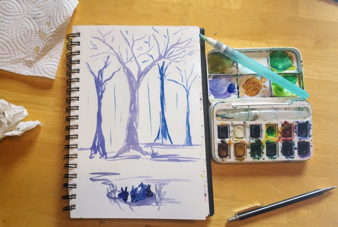
Tip #2: Get a little sketchbook.

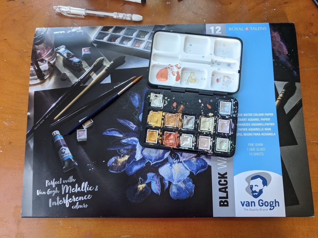
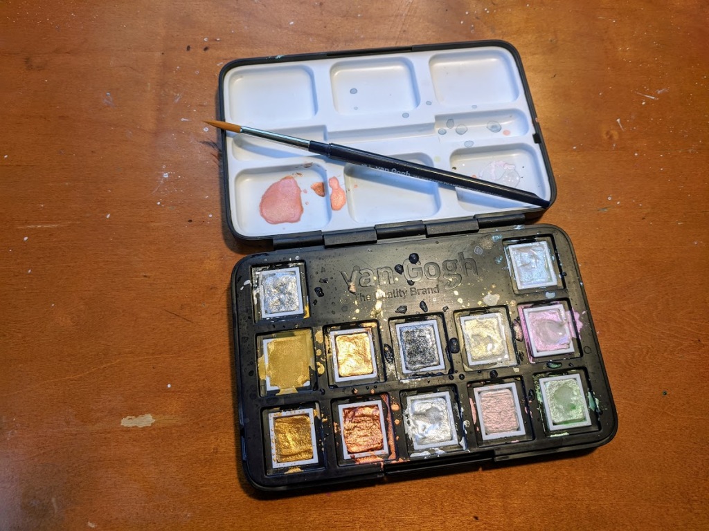
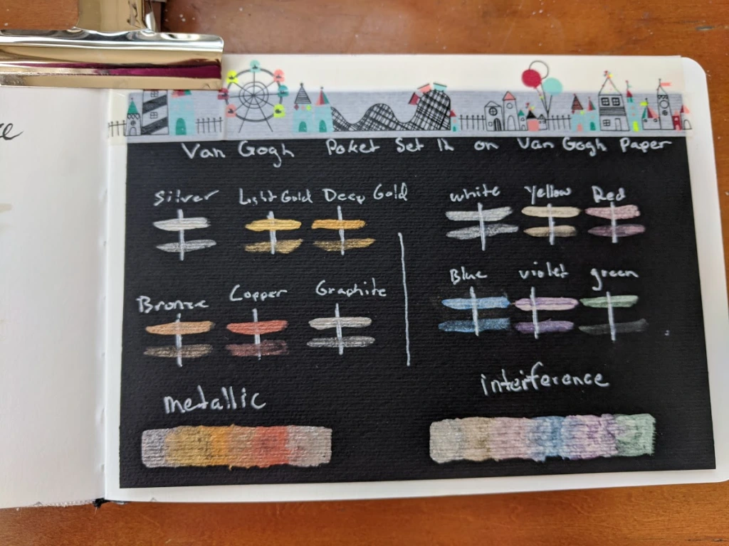
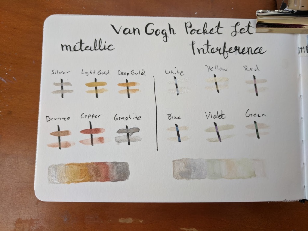
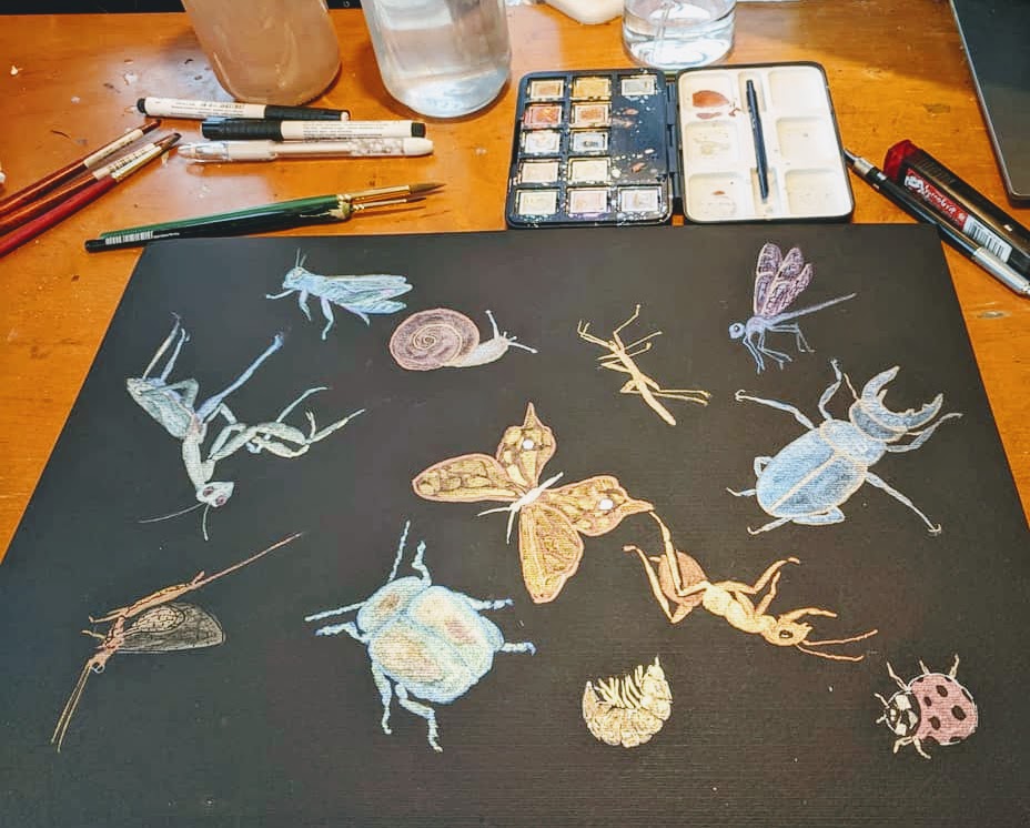
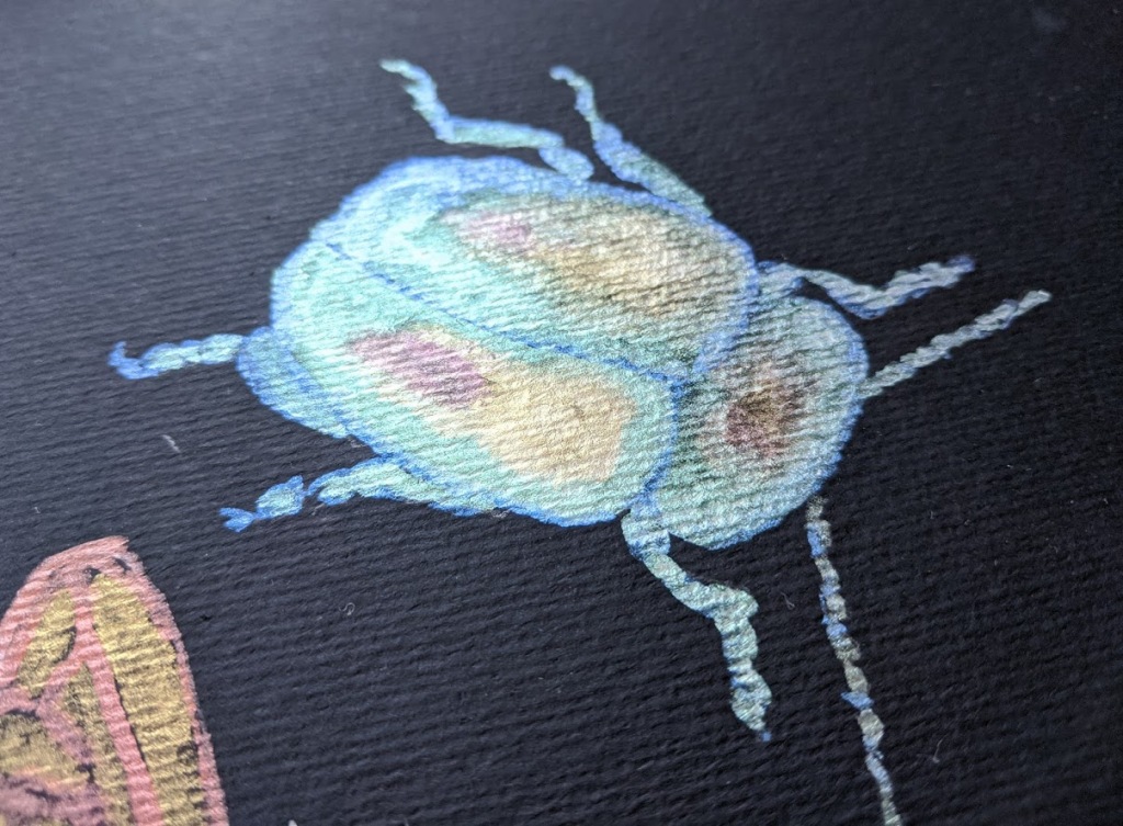
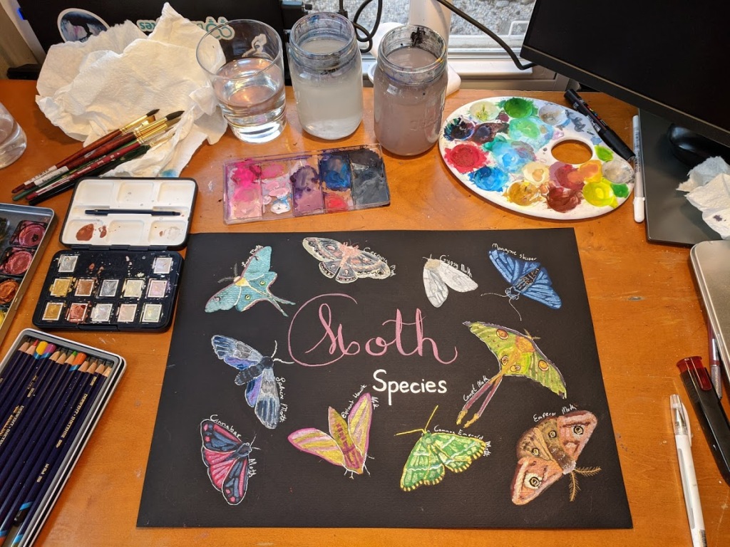
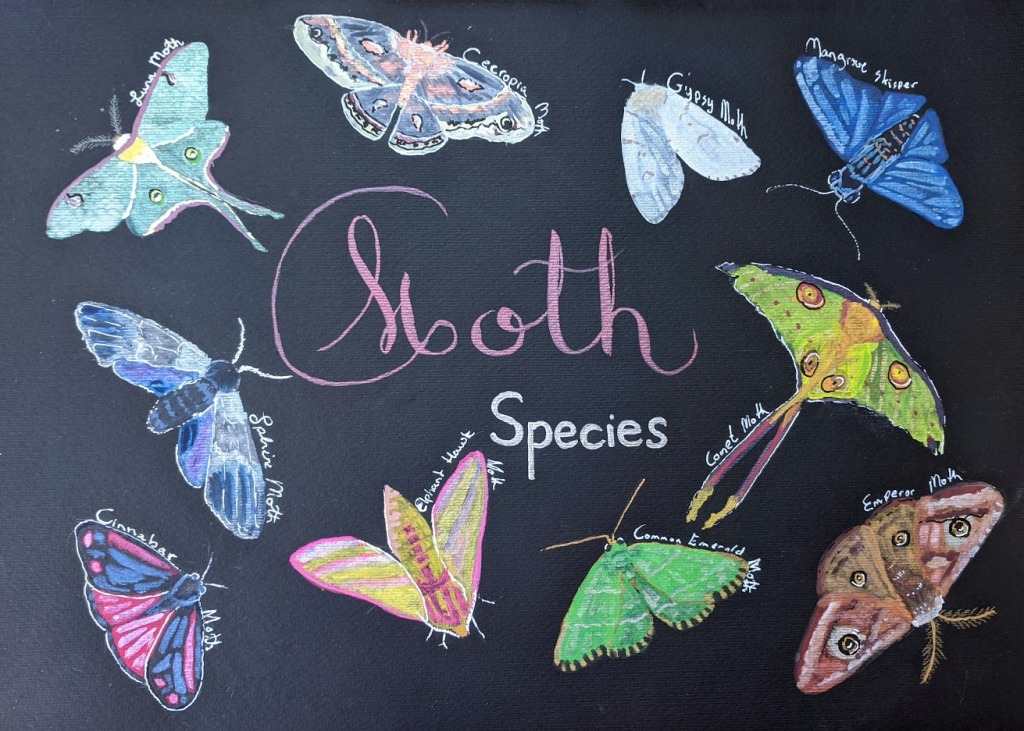
I have a few small sketchbooks I carry around with me. I have an itty bitty one for my purse. I have a bag packed with a few art supplies I can grab on my way out the door to take the kids to the playground. It contains a small travel watercolor pallet, a water brush, and a small watercolor paper notebook. I even have a small book and pen stash in my work bag. If I get the chance to do a little sketching on my coffee break or waiting at the doctor’s office I will take advantage of it. It is great to have some simple art tools on hand where ever you are.

Tip #3 Don’t have time to create a full piece? Practice the fundamentals.

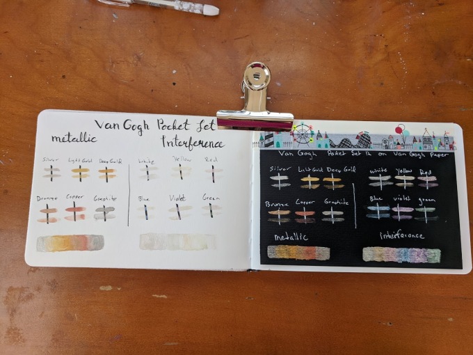
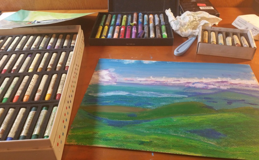
We need to spend time on brush, pen, and pencil strokes if we want to get really good at them. We may not have time to create a full painting but time spent practicing brush strokes is well worthwhile.  Here is a great tip I learned in Ana Victoria Calderón’s SkillShare Premium watercolor classes. Improve brush precision by painting small rectangles or interlocking shapes as close as you can get them without touching. You can spend as little or as much time on it as you like.

Tip #4 Have a family? Do art with them.

In my family, we have instituted a “Screen-Free Sunday” policy. One day without screens a week. Very often we spend time together on crafts. Right now favorite activities include creating pixel characters with Fusebeads and Poly-clay Mario power-ups. Sometimes I just draw simple images with a Sharpie for my youngest to color in.

Tip #5 Find your time sinks replace them with art.

For me, this was commenting on political articles on Facebook. I would do this to unwind at night, which is really counterproductive in today’s political climate. When I actually started to pay attention to the amount of time I spent on this I realized it was closer to an hour than fifteen minutes that I thought it was. I try to limit my social media time to friendly Facebook banter and Deviant Art which is a great place to network with other artists and see their work. I will admit I have little time for TV and video games because I would rather paint.

Happy Art Journey,

Justine

Finding Insperation Where You Are

It is easy to get lost in a Pinterest board of exotic landscapes, animals, or cultures. I do like to paint things I have never seen in person or have had little close contact with. Often what is new entices the eye and can catch one’s interest in a way the familiar cannot. Especially things on the other side of the Solar System or Galaxy at least for me anyway.

But, don’t underestimate what you interact with every day. We grow our skills when we create based on what we see around us. Even the most mundane things in our world. There is beauty everywhere. The humble blade of grass holds the loveliest translucent shade of emerald green. An ant can be an amazingly complex being to study and recreate. My backyard is full of wonders. Accuracy in art is based on the close study of a subject. We are in a stronger position if we study what is near us already.

Reference Images I Took in My Backyard Today for Future Work:

Below are some small bug studies that were inspired by my backyard. For the bee and Firefly, I did have to fall back on stock images (the little guys just don’t hold still long enough) but seeing them in my backyard inspired me to draw them.

Little Bug Studies in Color Pencil and Watercolor:


I have many lovely friends living in my backyard from hummingbirds to squirrels. Squirrels are really something I should start drawing as I see them every day.  For now, I have a few bird paintings to share with you that I have done recently. My watercolor work is not as strong as I would like it to be but I know if I keep painting the things around me I will improve. Art is not raw talent it is persistence.

Hummingbird Art Journal Entries:


I also have a family of Goldfinches living in my yard. The male loves sunflower seeds he will snap them out of seed heads while they are still mostly green. Growing sunflowers are a great way to attract birds to your yard. Below is a composite of a sunflower field not far from my home and the little seed raider in my backyard.

The Sunflower Thief  in Oil Pastel on Watercolor Ground

20170817_130824 (2)

Happy Art Journey,

Justine

Festive and Naughty Reindeer

Here are some of the reindeer cards I mentioned in my previous post. I have relied on Posca Paint Pens for these illustrations but I also utilized metallic markers in Prismacolor Premier seventy five set. I wanted to give the impression that the deer enjoyed the festivities themselves, perhaps even taking it a bit too far. I wanted the look to be happy and goofy. I had seen other illustrations of deer with decorations in there antlers and thought that was a fun look so I started there.

Festivities for All!
Bad Reindeer

This eventually lead to the idea of reindeer being naughty with their fun like a cat or dog knocking over the Christmas tree. I was inspired by a meme of a cat owner who had tied down their tree to cement blocks…

I am currently working remotely, so I created a digital image in Adobe Fresco, which I upload to Green Envelope to digitally send to my coworkers. The illustration is my first try at creating something in Fresco. The live brushes are quite a neat experience and help create images that look shockingly like traditional media. However, it did take me a while to figure out the controls.

I like Green Envelope. You can use their designs or your own, customize the envelope, even upload some music to the opening animation! It worked great and for sending something to my sons’ teachers as their school went full remote for the remainder of the year. I was even able to attach a Starbuck gift card!

Merry Christmas and Happy New Year!

Justine

Furbaby Holiday Cards

This year for Christmas, I decided to personalize the cards I created for my friends and family with their pets. I spent time scrolling through social media looking for images to model the cards on to create cutiefied version of each pet. In some cases, I had to ask for photos, which probably gave way the theme in advance. The card was a departure from my typical style—especially the cards I have sent in the past, such as my Starry cards and Reindeer cards

These were mixed media cards, but my primary tool was Posca’s fine point paint markers, which I have come to love for their very opaque colors. I especially liked the glitter pant markers for Christmas cards.

I don’t own any pets myself as I am allergic to dogs and cats, but I enjoy seeing other people’s pets. If the recipient did not own a pet, I sent a corgi card inspired by this lawn decoration.

Found at Lowes

I also sent festive reindeer cards which I will post separately.

Merry Christmas!

Justine

Jumping Back into Acrylics with Dreamscapes

I have not touched my acrylic paints in nearly two years. After I moved to a new city, they spent a year in storage. As we had opted to get an apartment for a year while we got a better feel for the area. I am a sloppy painter. A messy process, to begin with, but I somehow end up with paint on my elbows and in my hair when I paint on canvas. I don’t know how some people can just wear an apron and walk away with their clothing intact. So it seemed wise to put my paints in storage rather than attempt to use them in a carpeted apartment, the security deposit for which I wanted back. Add to that, a hectic year made worse by COVID-19, which increased my workload exponentially, and my paints sat in their boxes for almost two years.

Last month I took them out of their boxes and was pleasantly surprised to find all but two tubes in excellent shape. I was, however, not feeling all that confident and decided to dip my toes in the water with an ArtSherpa paint along with a tutorial on YouTube. Now I have mentioned Cinnamon Cooney before on this blog. I appreciated her positivity and grounded approach. I think she is an excellent resource for an amateur like myself that just wants to have some fun and paint something pretty. What sets her apart from the paint and sip type tutorials you may be familiar with is that she is a dedicated educator, and you will learn techniques and terms from her.

I landed on this tutorial of a Camp Fire Scene in Arcadia National Park. Which set me off on a bit of an after-work obsession for the last month of dreamy night skies.

My version swapped the man out for a woman as I imagined myself in this magical place. While I do enjoy it when other people appreciate my work. I really paint for myself, and it gave me a sense of peace to insert myself into this scenario.

My fire could use some work but I enjoyed making it. 🙂

I really enjoy the skies, and I often paint them in watercolor. But, I found this so relaxing I started doing more after work. They are not masterpieces, but the process of making them made me feel better after several tough and long workdays. I ended up switching to sponges for the Milky Way, which worked better for me. I found it easier to blend and get a more luminous effect.

First attempt on my own

I would walk away from my easel with a perspective on life that was more about wonder than feeling bleak. I guess that is the best you can really get out of any hobby.

I also love Aurora images and wanted to capture that dreamy magic.

I settled on calling these Dreamscapes—a landscape of imaginary night full of calm, shadow, light, and color. The idea for these was that after walking through the dark forest, one comes upon a lake or clearing illuminated by starlight and offers a good view of the sky through the trees.

I tried mixing time on the left, Aurora, MilkyWay, and sunrise On one landscape. To give the image a dreamy quality of merging three spaces in time into one. I wanted the image of the wolf to feel like an exciting surprise for the viewer after a long walk.

A lonely tree.

I hope to make a few more before I switch to ink for Inktober next month.

Happy Art Journey,

Justine

Fun with Black Paper 3: Van Gogh Watercolor Set and Paper

Due to my ongoing obsession with black paper, I decided to give a new brand (to me) a try Van Gogh watercolors. I picked up the Specialty Set of Metallic and Interference Watercolor (I paid $55, but its $45 at Cheap Joe’s right now) and a 16.5” × 11.7” black paper pad ($25). Made by the Dutch company Royal Talens. Van Gogh is their “student and artist” line.

I can never remember to take photos before I start using a new set.

I am generally not a fan of student grade watercolors with a few exceptions. Many are so low pigment and so tricky to work with it can take the joy out of a painting. While others are fine for practice if you don’t need your piece to be lightfast. I have student grade paints I use for pieces I intended to scan and turn into digital art because, for that purpose, lightfastness is moot. Outside of that, I generally tend to stick with professional-grade paints. But, the Rembrandt Special Effects pallet is very expensive at the $100 price point and did not seem worth the investment for what amounts to experimentation on my part at this point. But, I am contemplating picking up the Rembrandt specialty colors in tubes, especially the glass-based paint in the future, which seems to be a better value than the set.

The Van Gogh set comes in a plastic box with a mixing palette and a travel brush. The pans are removable and come individually warped so you can order refills of your favorites. I know, given this is a student grade, I should expect plastic, but I find this kind of plastic case hard to travel with as I can’t use magnets to hold the pans in place nor the clips you see in some metal cases. I like that the case is black, but I wish this was also true for the included mixing palette, which is white. It is tough to see the colors of the interference paints on white.

For student grade paints, these are relatively pricey, but I think they are good quality student paints. I would put the metallics on the same level as the beloved Finetec brand for opacity. They would make excellent brush calligraphy paints. The interference behaves differently than I was expecting. I have used interference acrylics before, and the color shift between colors when viewed from different angles. The mic coated particles shift between an opalescent color and its complement. Such as red to green or yellow to purple. The watercolor Van Gogh interference paint shifts from white to colored. But are still very pretty, and I can see applications for feathers, scales, and other iridescent features. The interference paints really pop on black paper and give subtle sparkle on white. They do not scan well, however, and the camera really does not do them justice either.


I decided to try to paint an illustration with just this set, which was rather tough, and I did end up falling back on my white and black pens for details after.

They worked much better for me as part of a mixed media piece with gouache, ink, and Finetec watercolors.

As for the paper, it is 140 lbs and is a reasonably decent watercolor paper. It will only buckle if you get it sopping wet but will then dry flat. It works excellent for brush calligraphy and illustration. The only drawback is both sides are rough, so for dip pen calligraphy, the Stonehenge pad is a better option. Overall I would say using these supplies was a pleasant experience, and I will defiantly experiment with them more in the future.

Happy Art Journey,

Justine